Last updated on December 14, 2015
Whether you’re doing it yourself or having someone help you, creating a vehicle graphic can be a tough job. A lot of people will try helping you by saying what you should do, but there aren’t many out there telling you what you should avoid doing. Believe me—avoiding these common flaws will help your vehicle graphic do its job much better.
Don’t go crazy with text
People don’t want to read your car. Treating your car like it’s a brochure or flyer won’t do much for you. However, you will want to treat it like other designs in that you want it to be as simple as possible to effectively get your message across. The kind of copy you’ll want are your organization’s name (or your name), a phone number and the kind of work you do. Maybe a tagline too, if you can keep it simple. It’s not a good idea to do much more than that, since most of the people who will see your vehicle will see it for only a split second. Some will see it for a little longer if you’re at a traffic light, but you can’t really count on that. Keep it simple and keep it prominent.
Be careful with photos
People will argue one way or the other when it comes to using photos on a vehicle wrap. The truth is, you can’t make a once-and-for-all statement about photos. If you are going to use a photo, you should be sure it does just two things: tells people what kind of work you do, and encourages people to get your contact info so they can get in touch with you. At the end of the day, that’s what any marketing will do, and it’s no different with vehicle wraps. If your photo ends up making the whole design too busy or it distracts from what you’re trying to accomplish, you should remove it, even if you really like it. Take a second to do an image search for “funny vehicle wraps,” then try to remember what the wrap was advertising. See if you can recall even seeing any contact information. It’s a tough line to walk, but it can be done.
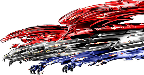
Don’t fear boldness
Not using photos can be equally as effective as using them, but you do need to be bold when you avoid them. If your design is low-key, it may say something about your company like being sleek or humble, but this is marketing. The whole point is to be as bold, loud and outgoing as possible without offending people. So if you’re not using photos, you should try to be as bold as you can with your design so it will stand out from the crowd. That means take full advantage of bright colors (except maybe neon colors) that are part of your branding. If your company uses reds and blues, use them. If your company’s logo is purple on a field of white, you might consider inverting that scheme so you can get more mileage out of people’s reaction to a purple car. Take advantage of any little thing that might be something to catch people’s attention.
If you want to boil this advice down to a main point, it would probably be to make your vehicle graphic as bold as you can without letting it distract attention from where you want it: on your organization. Keep that in mind, and your vehicle graphic will be a great asset to you.


Be First to Comment