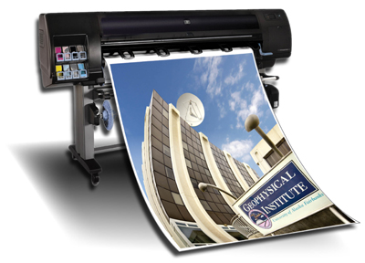
Ever have a great poster idea, dream one up, or have one explained to you which sounds just like what you were looking/hoping for? Well now what are you going to do with that idea? Now you are wondering how you can take a great poster idea from your head, to the drawing board, to the computer, then on to the printer. Let’s figure it out.
Whether you are working on a poster for yourself, your at-home-business, or your big booming business you are going to need tips/help with getting your poster designed then printed. Here are some tips that will help you to design and print a great poster for yourself or for your business:
Drawing Board
Getting your ideas on paper is the first and most important step to creating a great looking and effective poster. So, start out small by using a ruler and a pencil to draw out as many small rectangles as you can onto a piece of paper. Now use those rectangles to draw a bunch of different versions of the poster you have in mind. Sometimes drawing things out can help you come up with new ideas and refine the ideas you already have into more clear-cut images.
Computer/Design
Now it is time to take your top three drawing designs of your poster and recreate them on your computer using a design program. If you do not have a program that will let you create/design on your computer, or you are not very comfortable with your design skills, you may want to get a professional onboard at this point.
Whether you are designing the poster yourself or you are hiring some professional help you need to be aware of some do’s and don’ts when it comes to design:
- Use colors that have good contrast
- Try to come up with and use a theme within your poster design
- Use effective charts, pictures, and other data/graphics
- Use white space effectively (white space, does not necessarily have to be white, it is the space in a design with no text/images/other data.
Overall Goals
These are some of the overall goals you should have for the final outcome of your poster:
- Conveys a clear and simple message
- Some of poster is readable from far away
- Shows clear branding
Here are some of the things you should avoid when designing the final pieces of your poster:
- Avoid really small text
- Do not use more than 2-3 fonts in your design
- Use a hierarchy in your poster, design using columns, bullets, bolded words, and blocks of text to show hierarchy and organization
- Avoid fuzzy/pixalated images
Hiring a Professional
If you decide to hire a professional make sure you take a look at his or her design portfolio before you hire so that you can get a good idea of what kind of work they do and if that work fits in with the idea of your design.
Poster Printing
Poster printing in Columbus is a great place to start when you are trying to decide where to go in order to have your well-thought-out and well-designed poster printed and ready to go.

