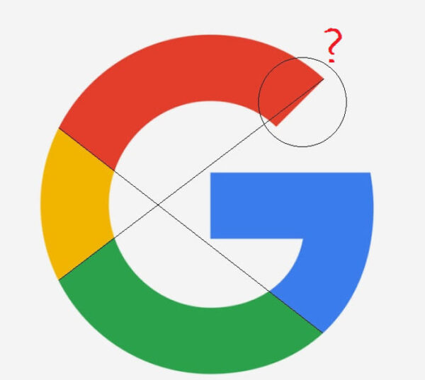
The sad reality is that examples of bad logo designs can be found everywhere. Yes, the rules for creating a great logo might not be written in stone, but you do not have to be a seasoned logo designer to be able to tell when a logo design simply does not deliver.
It could be that the colour choice is just plain wrong or the font is the element that haunts. Whatever the case might be, the good news is that at times all it takes to get the logo back on track is a quick fix. So, if you do not want to go back to the drawing board, first be sure to try one of the following five handy tips.
Find a better typography
One of the most common issues is when the typography simply does not match the rest of the logo design. When it comes to designing logos, good practice is to select a font that does not have too many frills. If you get stuck, try to change it to uppercase and see if it works better.
Remove an element
Inexperienced designers tend to want to include too many elements into their logo designs. And, who can blame them? After all, knowing when your logo design is really finished and ready to represent your business is not as easy as it might sound.
Luckily it is pretty straightforward to fix – simply remove an element or two. If there is clipart, that warrants an immediate removal! Ideally your logo should have only one element and some text. It is always better to keep your logo design as uncomplicated in design as possible.
Change the colour scheme
Contrast is good. The majority of logo designs require only one or two colours. According to Magicdust it is best to have two main colours and then you can add a suitable neutral colour like tones of grey or beige to your logo design.
Another option is simply to opt for a black and white logo. This can be especially effective when the website has a colourful background.
You can with icons
To give your logo a more streamlined shape, you can move the text and icon so that it resembles a badge. What makes this type of logo design so great is that using it for different projects is less challenging. If you can, try to stick to round and square shapes because it will make it much easier to use it online. By doing this you can use your logo as a profile image on your different social media platforms.
Unfortunately you will not always be able to save a bad logo design from itself by making small changes. There will inevitably come a time when you will have to come up with a brand new business logo design. So, know the signs when your logo design needs a complete redesign so that you can advise your client about the future of their business logo.

