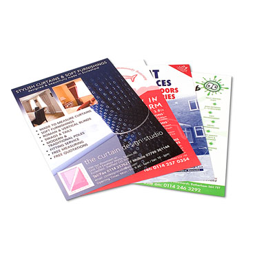
So, think flyers are a thing of the past? Think again; flyers are a traditional form of marketing that are still worth your time. Flyers are a unique marketing technique, they are some sort of cross between posters and brochures. Flyers provide more information than a poster but they get more attention than most brochures. Here are some great tips and creative distribution methods:
Wording
The wording for your flyers is important, you need to find a unique and creative way to call out to potential future clients in a way that captures their attention and informs them of new and upcoming services and products.
Design
The design of your flyer should be bold, unique, interesting, and eye-catching. If you are not sure how to use design programs like InDesign or Illustrator you may want to hire a professional so that your flyer looks and reads the way you want it to.
Here are some design principles you should follow when designing your business flyers:
- Hierarchy
Using things like bullets, headings, and subheadings is a great way to establish the hierarchy of information within your flyer.
- White Space
Make sure there is plenty of white space within the design of your flyer. White space provides a place for your viewer’s eye to rest from the rest of the design and words.
- Colors
Use the same colors that you use for the rest of the stationery, posters, brochures, logos, and other signage for your business. Using the same colors for all of those things creates a sense of consistency and helps with your branding.
- Headers and Subheadings Use headings and subheadings to make the hierarchy of the information on your flyer more clear. Use headings and subheadings to make the information on your flyer readable and skimable.
- Pictures/Graphics
Using pictures, statistics, and graphics on your flyer can make it more unique and interesting for viewers. Catch the attention of potential customers with bright and colorful pictures and graphics.
- Consistency Stay consistent with the rest of your branding so that your flyers look familiar to potential clients. You can use similar colors, the same fonts, etc. to keep your branding and flyers and logos looking consistent.
Call to Action
Before printing your flyers make sure to include some kind of call to action; if your potential customers have nowhere to go, no one to call, or a website to visit then there isn’t any point in having the flyer printed in the first place. Include one or more of the following on your flyer:
- Email address
- QR Code
- Social media link
- Phone number
- Coupon code
Printing
For all of your brochure, flyer, and postcard printing needs you can go to Alphagraphics, they provide the kind of quality service and expertise you should expect from a professional printing service. Printing your flyers through a professional service can help you to avoid simple mistakes and make your flyers look more professional.
Why They Work
Flyers work and they will continue to work and stand the test of time because not everything has gone digital. We still live in the physical world where billboard ads are seen by passersby and flyers are handed out to real people.

