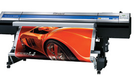
Roll-up banners can be one of the best things you can invest in, especially if your organization is planning to attend a trade show and you don’t have much storage or transport space. Roll-up banners not only condense to a small space, but they’re also frequently enclosed so the banner is protected, even should something heavy be placed on top of it. If you’ve gone to printing services in Red Bank, you might have seen some of your options. Below are a few things to keep in mind when you’re getting a banner ready.
Make it Right
A banner is usually quite simple. A literary parallel would be a short story—both have a fairly narrow focus and get the job done quickly. Since there probably isn’t a lot of text on the banner, imagine how embarrassing it would be if there’s a simple spelling mistake. Or an incorrect apostrophe. And if you’re going to a trade show or conference, a lot of people will see that mistake. The solution is simple:
- Once you write the text, use spell-checking software
- Double-check with a writer or editor to be sure the correction is right
Although this workflow is just two steps, it can be vital to saving yourself a lot of embarrassment on the show floor.
Make it Clear
There are a lot of ways in which something can get muddled on a banner. Maybe there’s very little contrast between the text and the background. Maybe the font is too complex for people to read easily. Maybe your messaging is hard to read. Whatever the problem is, something isn’t clear. It’s not hard to fix the above issues, but it gets harder when you feel like you’ve done everything right. Your first course of action should probably be to go to a writer or editor and find out what they think—is it clear, or should you tweak it a little? Most people don’t realize how hard it is to write good, clear copy until they try. Even if you feel worried the text isn’t up to par, get a second opinion.
Second, make sure the images and colors are saying what you want them to. An animal shelter shouldn’t have a picture of someone eating a hamburger. That sends the wrong message in many ways. Although that situation would be quite a stretch, it nonetheless illustrates the point. Be sure you pick a photo that fits well with your organization, your audience and your theme. If you’ve been focusing on a certain thing for a while and want to continue driving that message, then choose an image that reinforces the idea.
KISS
Keep it simple, stupid! There’s no need to put a lot of different things on a banner. The greatest feat in engineering isn’t getting to the point where there’s nothing left to add, but when there’s nothing left to take away. It should be the same with your banner. If you have anything that doesn’t add to your message or image, take it out. It could be a picture of a baby with a kitten, but it doesn’t matter. If it doesn’t add something to your banner, it has no place on it. Extra words in copy take up valuable real estate, just as a picture would.
You might go around to a bunch of printing services in Red Bank looking for design tips on roll-up banners. Just remember that even if they give you advice that contradicts this article, you have to make an informed decision for yourself. People can give you advice and tips until your ears fall off, but you still have to make the decision. You know your organization, audience and messaging better than anyone else, so you will make the right decision.

