There are a lot of things to be aware of when designing a business logo, from the type of font you place on the card to the colors and images you should use. You don’t have to be a professional designer to make a professional business card, simply use the following 5 do’s for logo design and make sure to ask the opinion of coworkers and friends.
Here are the top 5 things you should look for and be aware of when you are designing your business logo:
1. Colors
The colors on your business card should reflect the ideals and mood of your company; for example if your company has a more professional mood than you should use darker more professional colors like navy blue or dark green. Another way to know what colors you should use on your business card is to look at your logo or the colors that are already in your store and use them for the background or text.
2. Images
If you have any images on posters for your business you may want to consider using them for your business card as well. You shouldn’t put images on the front of your business card because it detracts from the text/business information. However, images look good on the back of a business card.
3. Logo
Including your company logo on your business card is a great way to help people remember you and your business; this is also a good way to help people make the connection between your card and your actual storefront. Don’t be too shy when you are trying to market your Logo either.
4. White Space/Rule of Thirds
Using white space on your business card is a great way to organize the information and give your eye a break from the design. White space is not simply the absence of information; it is the purposeful placement of nothing so that the eye has a place to rest. You can also use the rule of thirds within the design of your business card. The rule of thirds is when you divide your canvas (or in this a case business card) into a grid of three horizontal lines and three vertical lines and you place important information right on the spots where the lines connect on the grid.
5. Font/Text Spacing
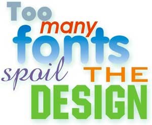
Since a business card has a limited amount of space you should choose a font that is easy to read when it is a smaller size. The small size of your business card also means you want to limit the number of fonts you use. Limit yourself to one or two different fonts. Organize your text according to importance and make sure the spacing makes it easy to read.
Printing
Printing at red bank is a great way to ensure that your business card is printed with the highest quality paper and equipment. Make sure you print a big batch of your business cards so that they last for a long time and so that you do not have to print them again in the near future.

