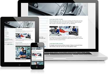
Is your website optimized for mobile phones and tablets? These devices will help you out everywhere thanking to new technologies. But your website should develop with them.
We will talk about how to minimize the website while maximizing search opportunities.
Smarter phone smarter – smarter buyer – smarter website
Mobile devices increase your chances to attract more customers.
In 2014, there is no need to stay at a desk waiting for webpage to load. Now we can search for information using the tablet or smart phone from anywhere in the city or in the world. That is why it is important your website to be presented in the mobile world, optimized for search engines and establish contacts with customers.
Here’s how it works:
• Google AdWords allows you to choose keywords that are suitable for mobile devices;
• working with the mobile website version use principles of optimization: mobile keywords to create a meta tags, titles, headings;
• do not overload the reader with information – let your text to be simple and easy-to-read; upload smaller size pictures as they are more convenient to use;
• Make sure you have beautiful and clear fonts and important buttons are stand out (size, color etc).
To allow your potential customers browse your website while having a walk on the street you have to make certain changes. Most websites use two URL: one is for the mobile version, and another one is for desktop version of website. Nowadays Google has a crawler that searches the mobile version of desktop websites for indexing.
As a result, two identical pages indexed as one page. Now your website is found even easier if it is properly optimized.
How to make a mobile version of website
There are three “a must” points needed to make a mobile version of your website.
1. Optimization fundamentals for website mobile version.
• Make your content attractive even on a small screen, using CSS code. Reduce the size of pictures and make sure that fonts and the contents are easy to understand.
• Optimize your content and images adding keywords from Google AdWords. Also distribute them across the page.
Tips: create a native application for mobile devices if you have an ecommerce website. The application will give you a competitive advantage: the client will not need to wait for a page to load. Ask your website development company to consult you on this matter.
2. Think about the design: Google Transcode and mobile subdomains.
• Google Transcode analyzes the original HTML-code of website and converts into a mobile device format. Using this tool from Google for re-coding a classic HTML to mobile HTML, you may get an ugly picture resizing, abnormal changes in page content and as a result frustrated customers. How to avoid it? Create a mobile version subdomain.
• Mobile subdomain: create a subdomain specifically for your mobile website. This is crucial for search and indexing in search engines. Different URLs for mobile and desktop versions allows SE crawler to visit and index your website mobile version separately from the desktop one, and then display the results of queries on mobile devices.
Tips: Avoid using Flash, Java, Ajax and Frames. Instead, try to XHTML (WAP 2.0), cHTML (iMode) or WML (WAP 1.2).
3. Mobile prewview: do not be deceived.
• Manage site through WSC Mobile and analyze it in browsers and on mobile devices.
Hint: Not all people have switched to smartphones. There is a category of users who connect to the Internet using a standard mobile phone. So make sure your site looks good on any screen.
Marta Gromadzka is a writer and editor with a wide variety of experience, including writing for websites internationally and editing books on many different subjects and in a variety of formats.


Be First to Comment